

|
|
|
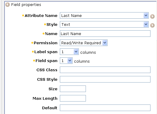
You select a field to edit its properties. Each field has different properties. For example, the Last Name field uses some common properties, which are shown in the following figure:
You can set the following properties for a field:
Note: The fields that are displayed in the Field Properties screen are determined by the option you select in the Style field. You may not see all of the fields described in this list.
Specifies the name of the attribute in the directory.xml file.
Determines the presentation of the field.
Style Options lists styles that you can select for a field.
Specifies the label you want for this attribute in the task.
Determines the privilege level for the field.
Note: If a field is required by the user store, choose a Required setting. Required fields are indicated by a yellow dot in the screen.
Specifies that an administrator can view but not modify the field.
Specifies that an administrator can see the current value of the field (if one exists), and can enter a value for the field.
Specifies that a field is required, but otherwise functions as the Read/Write setting.
Specifies that an administrator cannot see the current value of the field (if there is one), but can enter a value.
For example, an administrator can change a user's password, but cannot view the user's current password.
Specifies that a field is required, but otherwise functions as the Write setting.
Specifies the number of columns that the label will span.
Specifies the number of columns that the field will span (excluding the label)
Determines the format of dates displayed in a field and in the Date Picker control. Specify the date display pattern using Java conventions. For example, the following Java expression is displayed as Oct 2007:
MMM yyyy
For more information about Java date formats, see the documentation for the Java™ 2 Platform Std. Ed. v1.4.2 at the Sun website (http://java.sun.com/j2se/1.4.2/docs). Search for SimpleDateFormat.
Note: The Date Display Pattern field appears only when the Date Picker style is selected.
Specifies the Cascading Style Sheet class that controls the presentation of this field.
Determines field properties and style defined using HTML property tags.
You can use this field to set the width of a field. For example, to set the width of a field with the Drop Down style to 300 pixels, you specify the following in the CSS Style field:
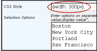
Note: By default, the width of fields that include a list of values, such as a drop down or multi-selector box, is set to auto ({width:auto}). This setting sizes the field to accommodate the largest value in the field. For example, if the largest value in the City option selector field is San Francisco, the option list is sized to display the entire value.
You can also use the CSS Style field to control other display properties, such as text size and background color.
Specifies the number of rows that a text area for user input should include.
For example, you may want to define a text area for the Description field, which allows users to enter four rows of text.
Note: This field is available only when you select the Text Area style.
Specifies the number of columns in a task screen that a text area for user input should span.
For example, you may want to define a text area for the Description field, which allows user comments to span all of the columns on the text screen.
Note: This field is available only when you select the Text Area style.
Specifies the value of a field when its checkbox is selected. For example, the checked value for the Enabled field is true.
The default value is true.
Note: This field is visible when the checkbox style is selected.
Specifies the value of a field when its check box is cleared. For example, the unchecked value for the Enabled field is false.
The default value is false.
Note: This field is visible when the checkbox style is selected.
When unchecked, sets the value of the attribute to false in the user store if the attribute is empty. When checked, Identity Manager allows the attribute to be empty.
Use this field to automatically set empty attributes to false in the user store.
Sets the default value (true or false) for the field.
Specifies the size of the field. Enter a number based on the style of field. For text and password, enter the number of characters. For drop-down, select, multi-select, and multi-text, enter the number of rows.
Specifies how a field that contains multiple options is populated.
Identity Manager will not use an external source for selection options.
Specifies that Identity Manager will populate the options in the field using a Select Box Data XML file.
Allows you to enter a list of options in a text box. If you select this option the following field appears:
Selection Options
Enter options on separate rows. If the option has separate display and storage values, enter them as "storage-value;display-value".
Specifies that Identity Manager will populate the options in the field based on options in a other field on the task screen.
Dependency on another field is defined in a Select Box Data XML file.
Specifies JavaScript that contains the options for the field. If you select this option, the following field appears:
Selection Options (JavaScript)
This JavaScript must contain a function with the signature "function getOptions(FieldContext)" and return a pipe delimited string of options. If the option has separate display and storage values, enter as "storage-value;display-value"
Specifies if Identity Manager will preserve the user defined options in a select based control field that is populated using Select Box Data. For example, a drop down combo box 'City' allows a user to add custom values to the field. The other options for the field 'City' are populated using Select Box Data. The setting for Preserve non-options will determine if Identity Manager will retain the user defined value set to the field 'City' or force the user to use only the values populated using Select Box Data. The Preserve non-options should be enabled to allow the user to add custom data to the select based controls.
Disabled. Identity Manager will force the user to select only the valid options.
Sets the maximum number of characters that can be entered for this field.
Sets the text that appears above the list box that contains selected items in the object selector.
Sets the text that appears above the list box that contains the items that are available for selection in the option selector.
Indicates the value that is displayed by default, and that is stored in the profile if no other value is provided.
Note: For a checkbox, enter true to make the default enabled; enter false to make the default disabled.
Task-Level Validation describes validation properties.
Enables you to use JavaScript to set the default value for a field. Using JavaScript, you can set the value dynamically. For example, you can set a default value based on other attributes.
Use this field for Create tasks only.
Enables you to use JavaScript to set the default value for a field. Use this field for any task type.
Note: The JavaScript in this field executes after the JavaScript in the Default JavaScript field.
Contains a regular expression that performs task-level validation
Contains the fully-qualified name of a Java class that performs the validation, for example:
com.mycompany.MyJavaValidator
Identity Manager expects the class file to be located in the root directory designated for custom Java class files.
Contains the complete JavaScript code that performs the validation.
You must provide JavaScript code in this field. With task-level validation, you cannot reference a file containing JavaScript code.
Disables the AutoComplete feature in Internet Explorer. If this check box is selected, Internet Explorer does not attempt to provide suggestions for field values based on previous entries.
For more information on the AutoComplete feature, see the documentation for Internet Explorer.