

|
|
|
The following process is one way of creating an easy set of a dependant drop-down boxes.
Note: The two lists should be hidden (automatically) and the two items should be set as drop-down boxes.
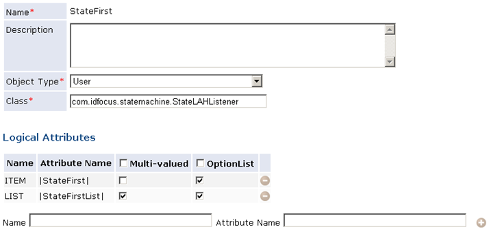
This policy is of type Task and runs at (Run at Event) Set Subject. An action in this policy sets values to the list attribute of the first handler. In the example, that would be |StateFirstList|. This policy can also assign an initial value to the item attribute, if a current value is available.
This policy is of type Attribute and runs at Validation. The value of the first drop-down box is read as a normal attribute of the user, and is taken from the item attribute. In the example, that would be |StateFirst|. An action in this policy sets values to the list attribute of the second handler, based on the result from the first.
When using this screen, the first policy sets optional values to the first drop-down box. When a value is selected, the second policy updates the options in the second drop-down box. You can do various things with the results of the second drop-down box. For example, you can set up a third policy of type Task that runs at Validation (different from attribute validation) and copies the value in the item attribute of the second handler to a physical attribute.